• INTERIOR DESIGN
  • Porcelain Collection
  • about / contact
Charles Burleigh
  • INTERIOR DESIGN
  • Porcelain Collection
  • about / contact

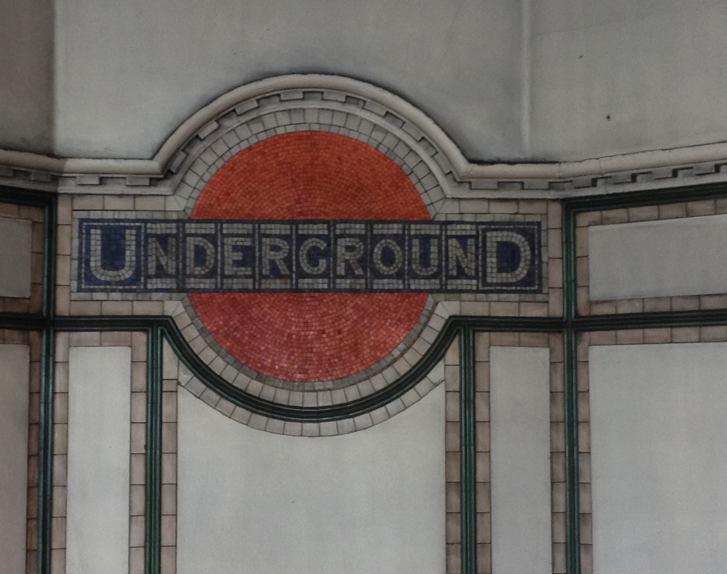
Helvetica is one of the most beautiful typefaces ever created, it is clear, concise and extremely adaptable. As the design world saw a revival of older sans-serif typefaces, it was designed in 1957 by Max Miedinger and Eduard Hoffman at the Haas Type foundry in Switzerland. Initially called Neue Haas Grotesk, it was re-named Helvetica based on the Latin name for Switzerland. As the brilliant film Helvetica explains, it has become the default typeface in contemporary visual communication. Lest we forget that there are so many ways to communicate with text, here are some examples, Helvetica not withstanding.

View fullsize  How may layers of text; inside, on the window, on and in the food truck, street sign, phone booth, and across the street?
View fullsize  How would you need to know anything more about Mr. Pickle?
View fullsize  My birthday cake, could this be any more endearing?
View fullsize  With a few abbreviations, the push of a button could change your path forever.
View fullsize  Hand painted and gracious.
View fullsize  A mound in a triangle means calm traffic?
View fullsize  Look both ways and trash days.
View fullsize  If the pictograms are so precise why is each one explained?
View fullsize  Still confused.
View fullsize  Scrawled with a diamond, to memories long forgotten.
View fullsize  An elegant directive for staff.
View fullsize  A classic logo rendered in an ancient medium, the lines above and below the middle text referencing the tunnel.
View fullsize IMG_2222 - Version 2.JPG
View fullsize  How could Lady Street be anything but unsuitable for heavy viehicles?
View fullsize  Is this where handkerchiefs originated? Should it be re-named Kleenex Place? Or maybe Pankey Place is around the corner.
View fullsize  An almost retro logo rendered large.
View fullsize  Rendered by hand proudly above and mischievouslybelow.
View fullsize  Wedding invitations here, so Royal.
View fullsize  As seen from Car Talk Plaza.
View fullsize  A proud plaque, honoring a philanthropist and inventor long forgotten. "In exile he won high places of trust and command."
View fullsize  A proud "D" in the pediment makes the other signs seem so fleeting.
View fullsize  A favorite logo for Chef's Warehouse.
View fullsize  Well said.
View fullsize  Major bling.
View fullsize  More major bling.
View fullsize  A tiny world rendered in pierced tin.
View fullsize  Truck drivers be warned.
View fullsize  A refined beacon of compassion.
View fullsize  A polite direction to the rear entrance.
View fullsize  Groceries, liquor, ATM, bus stop, and thank you for shopping here your business is appreciated.
View fullsize  Raise plow for John the Martyr whole block.
View fullsize  I want to park here.
View fullsize  Be careful what you ask for.
View fullsize  Nothing more nothing less.
View fullsize  On the job in Miami, italics add just the right bit of dash.
View fullsize  For medicianl purposes only.  
View fullsize  Is this in code?
View fullsize  Who wouldn't want to knit after seeing this.
View fullsize  Cheeseburger and watermelon cake. A full meal in a cake, with an ant.
View fullsize  Laundromat, self service or drop off, watch batteries replaced, watchmaker on premises, Polish spoken here, no smoking, stop bed bugs now! bedbugking.com, se habla Espanol.